My Role
UI/UX design (Solo Volunteer Work)
Drinxfactory App
Re-desiging the Drinxfactory app to improve UI/UX
Drinxfactory Overview
Drinxfactory Group is a sales and activation specialist organisation that focuses on the fast-moving consumer goods (FMCG) sector, with a specific emphasis on the liquor industry. Drinxfactory stands as the pinnacle partner for businesses within the liquor industry, offering specialized services in merchandising, brand activation, and in-store sampling. With a laser focus on the unique needs and dynamics of the liquor sector, they provide tailored solutions that elevate brands and drive results.
Drinxfacotry Web App Overview
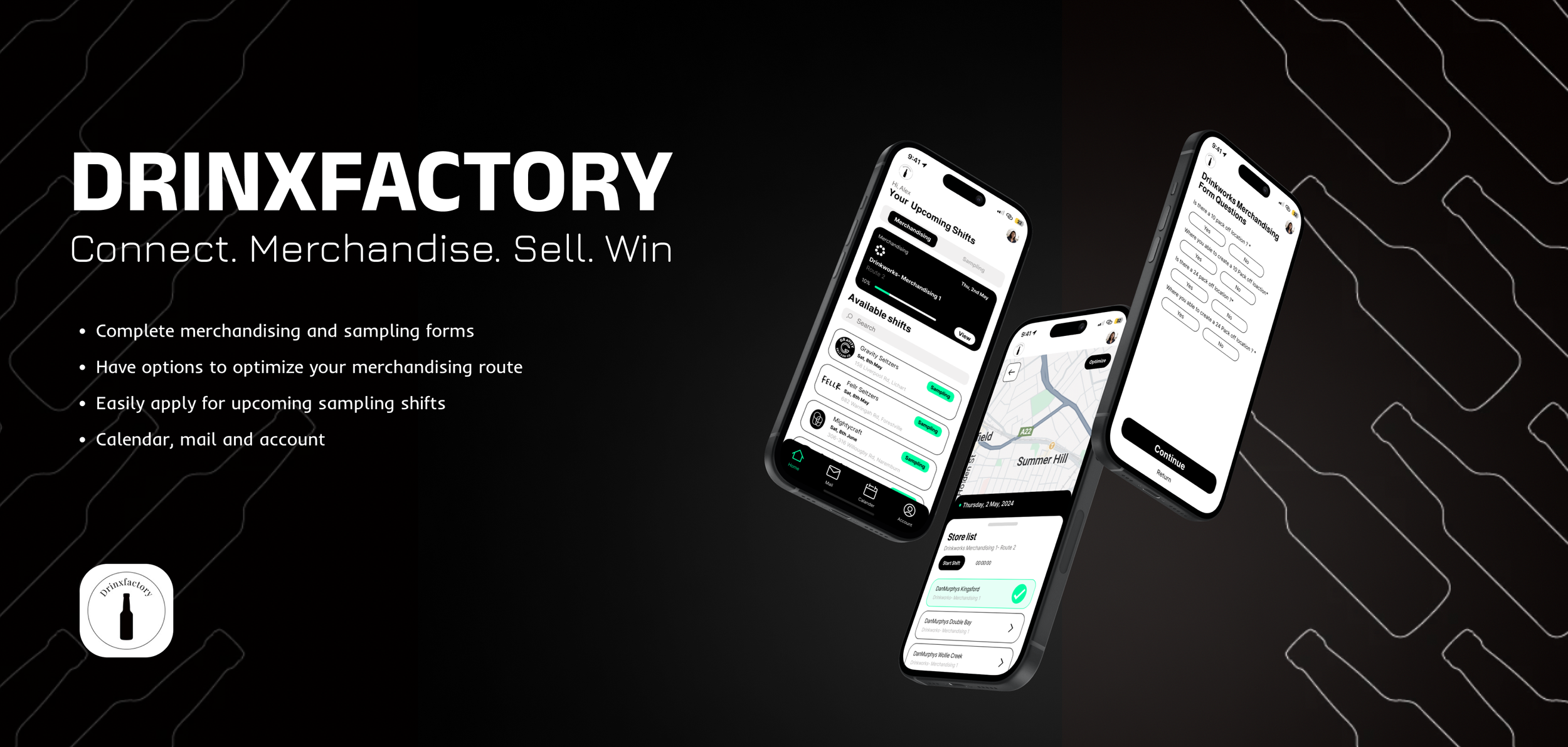
The Drinxfactory app is a comprehensive platform designed for the sampling and merchandising team to efficiently complete company forms while in-store. Serving as a central hub, it allows all Drinxfactory employees to access shifts and apply for job opportunities seamlessly.
Apply for Sampling Shifts: Open sampling shifts are posted on the Drinxfactory portal, enabling employees to view and apply for their preferred jobs directly from their phones.
View Upcoming Shifts: Employees can easily view their upcoming shifts and store lists, ensuring they can plan and complete their work efficiently.
Work Forms: In-store, the app acts as a platform for completing sampling and merchandising forms, capturing essential data and simplifying task completion for employees.
View Emails: The app notifies employees of important emails and allows them to view these communications within the business.
While the current app functions well, there is significant potential to enhance overall functionality and introduce additional features to further support Drinxfactory employees.
The Goal
Stage 1.2. Identifying New Opportunities
Stage 1.3. Identifying Important Opportunities
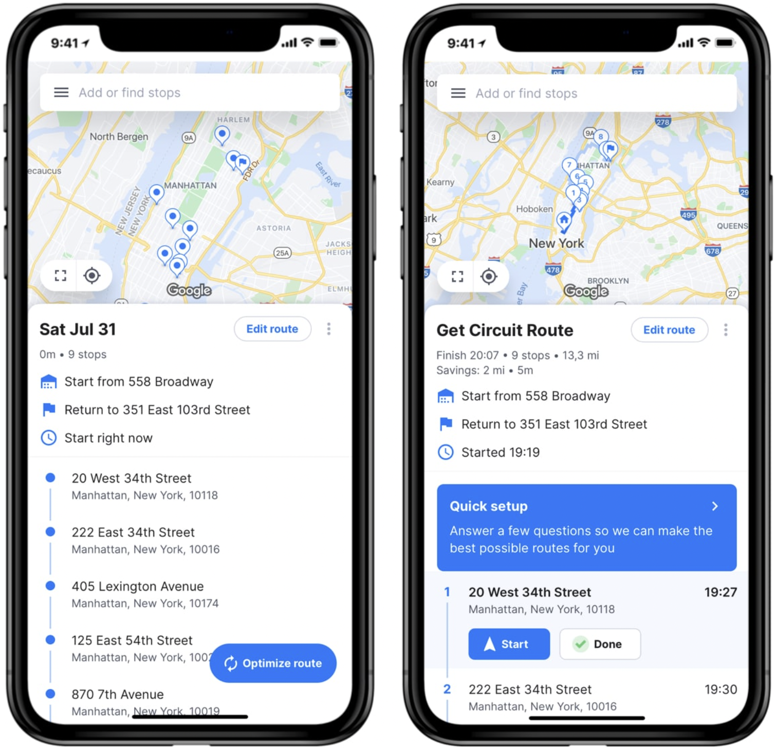
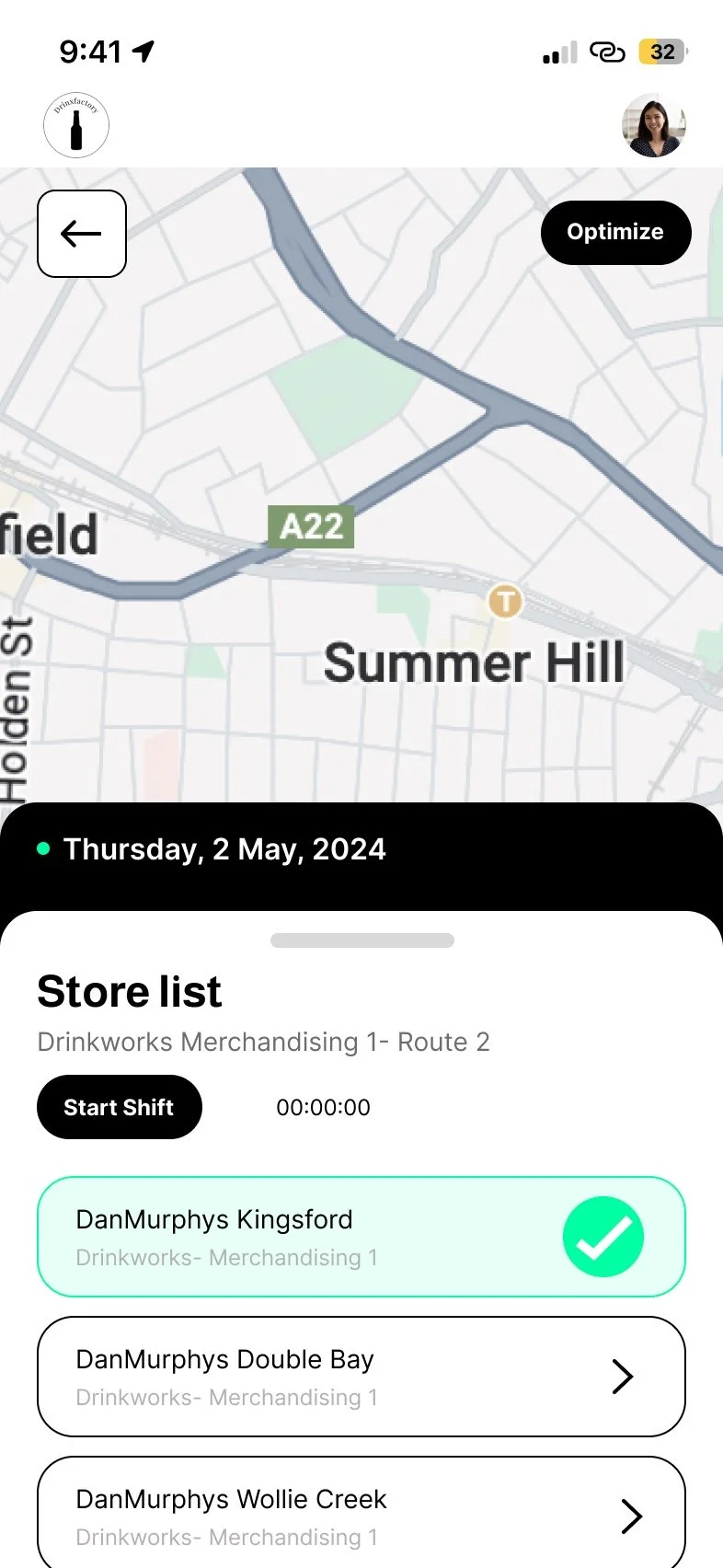
Optimize Route Map
Include a map in the design that allows users to view their shifts, the locations of their stores, and optimize their route. Additionally, users should be able to preview stores before starting their shift.
3 Months
Duration
Figma, Sketch
To redesign the Drinxfactory app, enhancing both its functionality and user experience.
Although the app serves its purpose, it has numerous bugs and issues affecting overall user flow. In this project, I aim to identify these problems and pinpoint opportunities to enhance functionality, ultimately making employees' jobs easier.
Stage 1. Identifying the Problem
User Interviews
Tools
Poor Navigation
Almost all employees I interviewed highlighted the poor navigation of the current system and frequently mentioned that the layout is confusing. New users struggled to locate certain features.
Overload of Unnecessary Information
Interviewees observed an abundance of useless features and information they never used, while new users often asked, "What's this? Is that important?" These unnecessary features distracted users from completing their tasks.
Difficulty Location Your Shifts
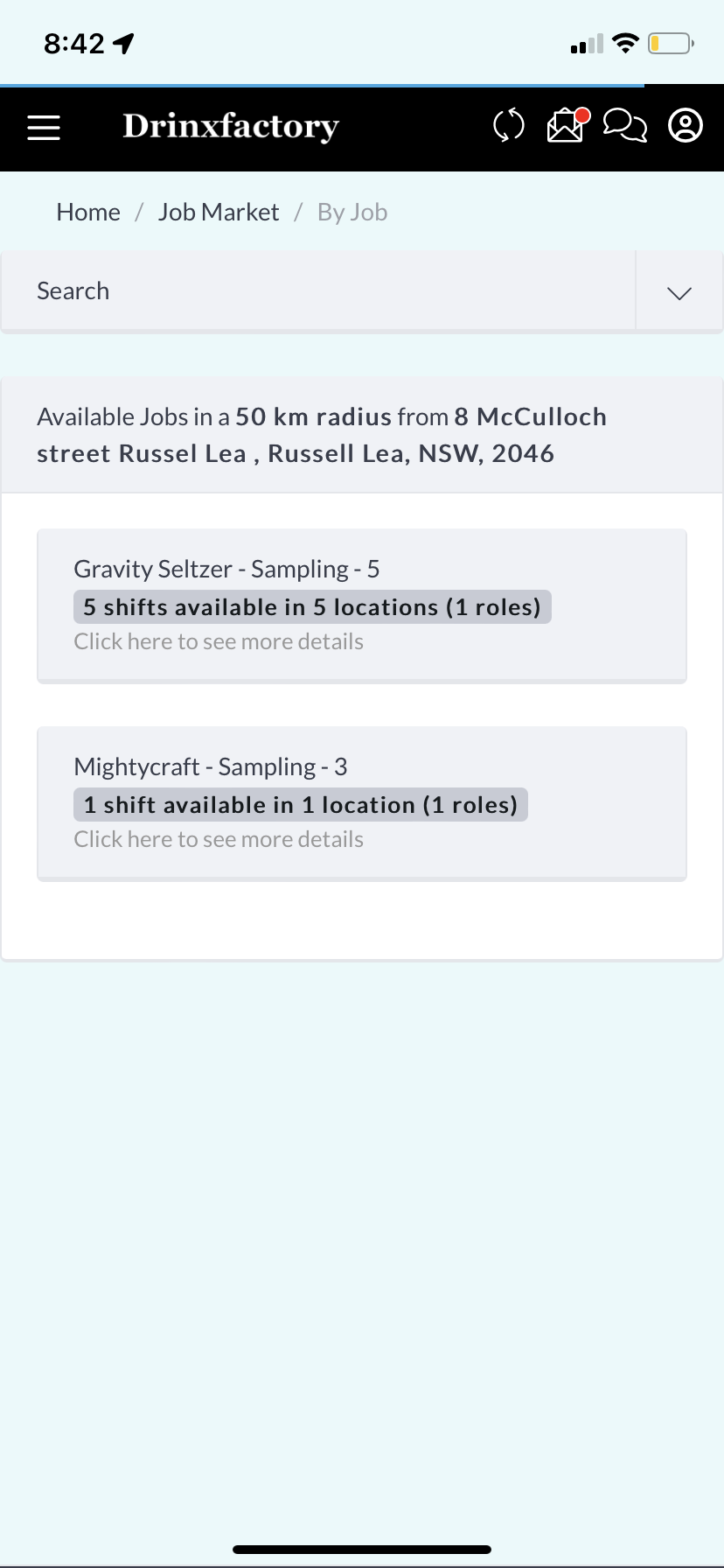
Users felt it was hard to differentiate their merchandising shifts since the app only displayed a list of stores and dates without clear separation. Many found it difficult to find and distinguish sampling job offerings, noting that it wasn't clear what product they were selling, or when and where it would be.
Current Design
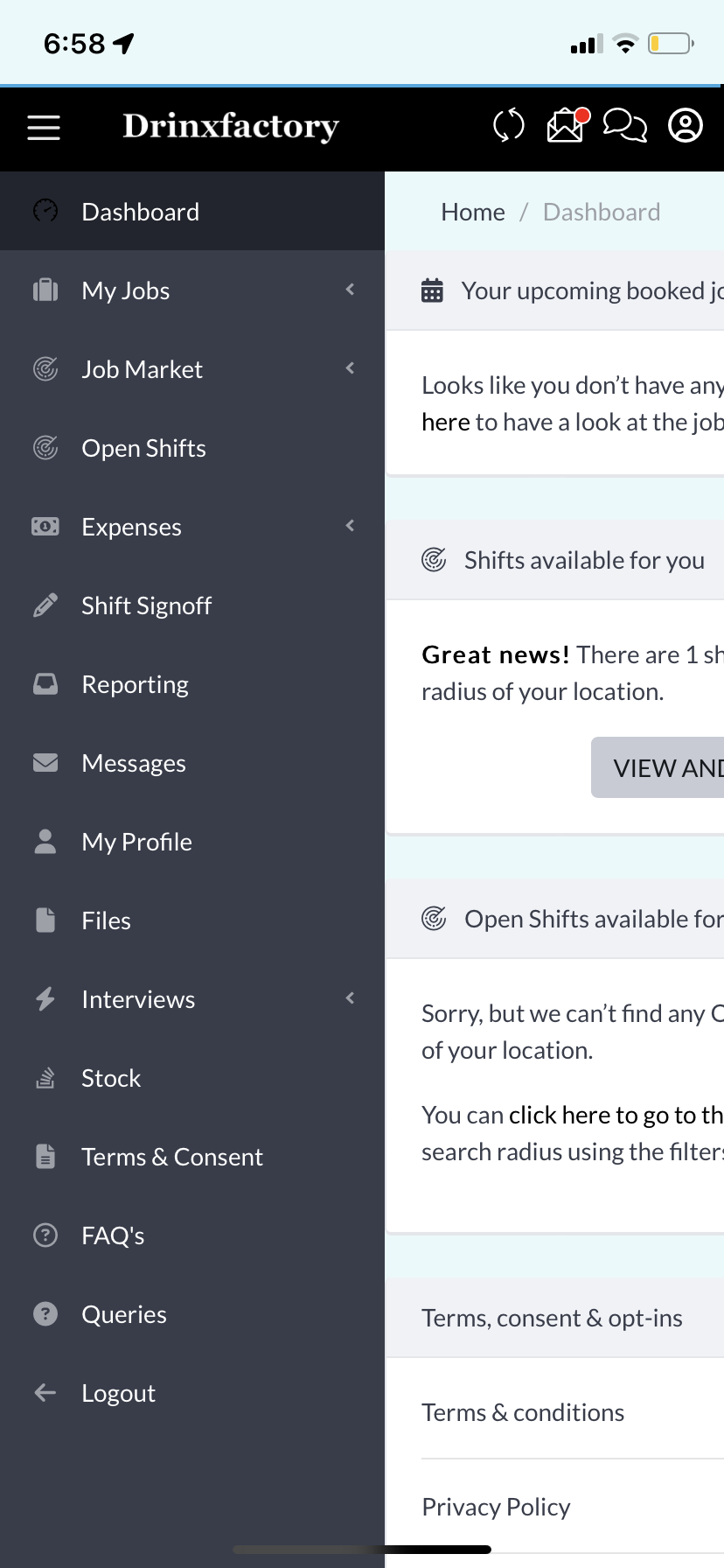
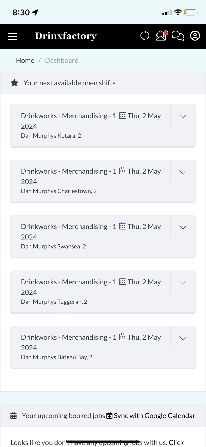
Shifts are piled in a list, making it difficult to differentiate between multiple jobs on different days.
Listing the stores in this manner also confuses users when deciding which one to click on to start their shift.
Available shifts are on a separate page, making them harder for users to find.
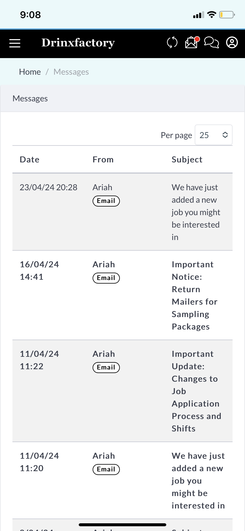
The subject line of emails wasn't clearly displayed, making it difficult to identify the importance of each email.
Users frequently missed pressing buttons because they were too small.
Home Page
Available Shifts
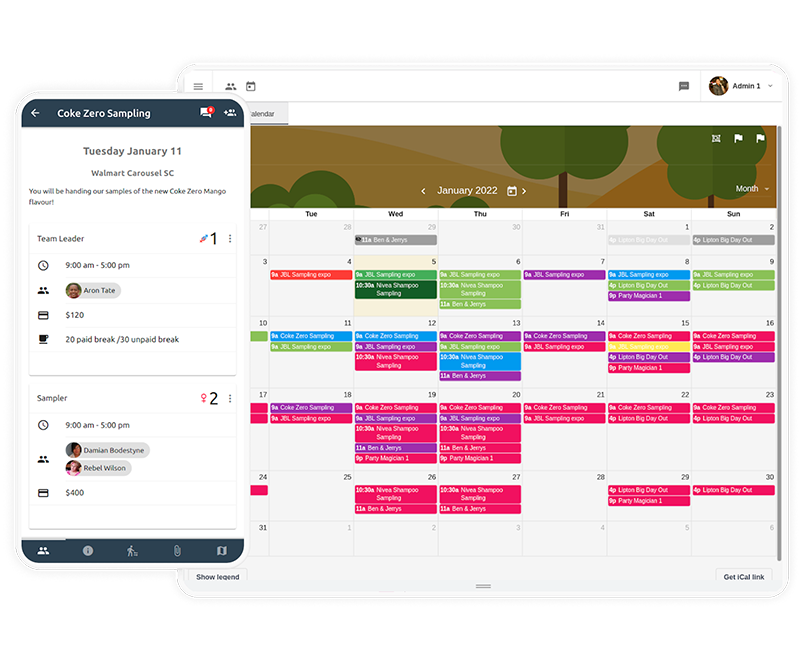
The previous application used by Drinxfactory, StaffConnect, included a calendar feature that allowed employees to view their personal schedules, check their shifts for specific days, and see available shifts. Employees found this system very convenient for managing their schedules and applying for new shifts, and it helped prevent double bookings effectively.
Separate shifts into blocks
Separate every shift into distinct blocks to ensure clear identification, with a specific separation between merchandising and sampling shifts to prevent mixing them together.
Stage 2.2. User Testing
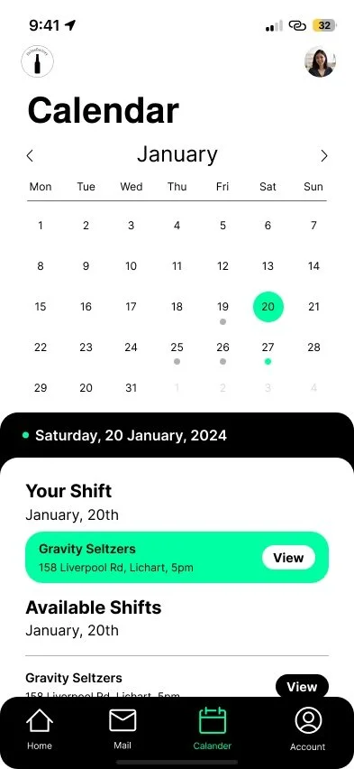
Personalized Calendar
A personalized calendar that allows you to view your scheduled shifts and also displays available shifts on specific days.
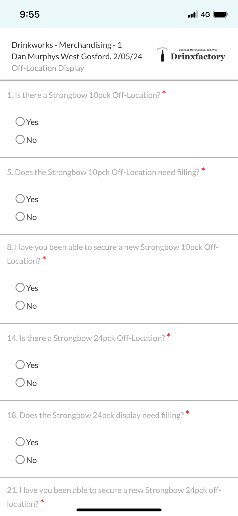
Form Questions
An application like Circuit Route Planner offers optimized routes for delivery drivers, saving time, money, and fuel. There is significant potential to integrate an optimized route filter within the Drinxfactory app. This enhancement would assist merchandisers in navigating their store lists more efficiently, eliminating the need to switch between applications. It also saves the business money by enabling teams to complete their shifts more quickly.
Information Architect
Include Only Whats Important
Strip down the app to include only necessary features, such as removing extras like messages, interview stock, and others.
Stage 2. Design Ideation
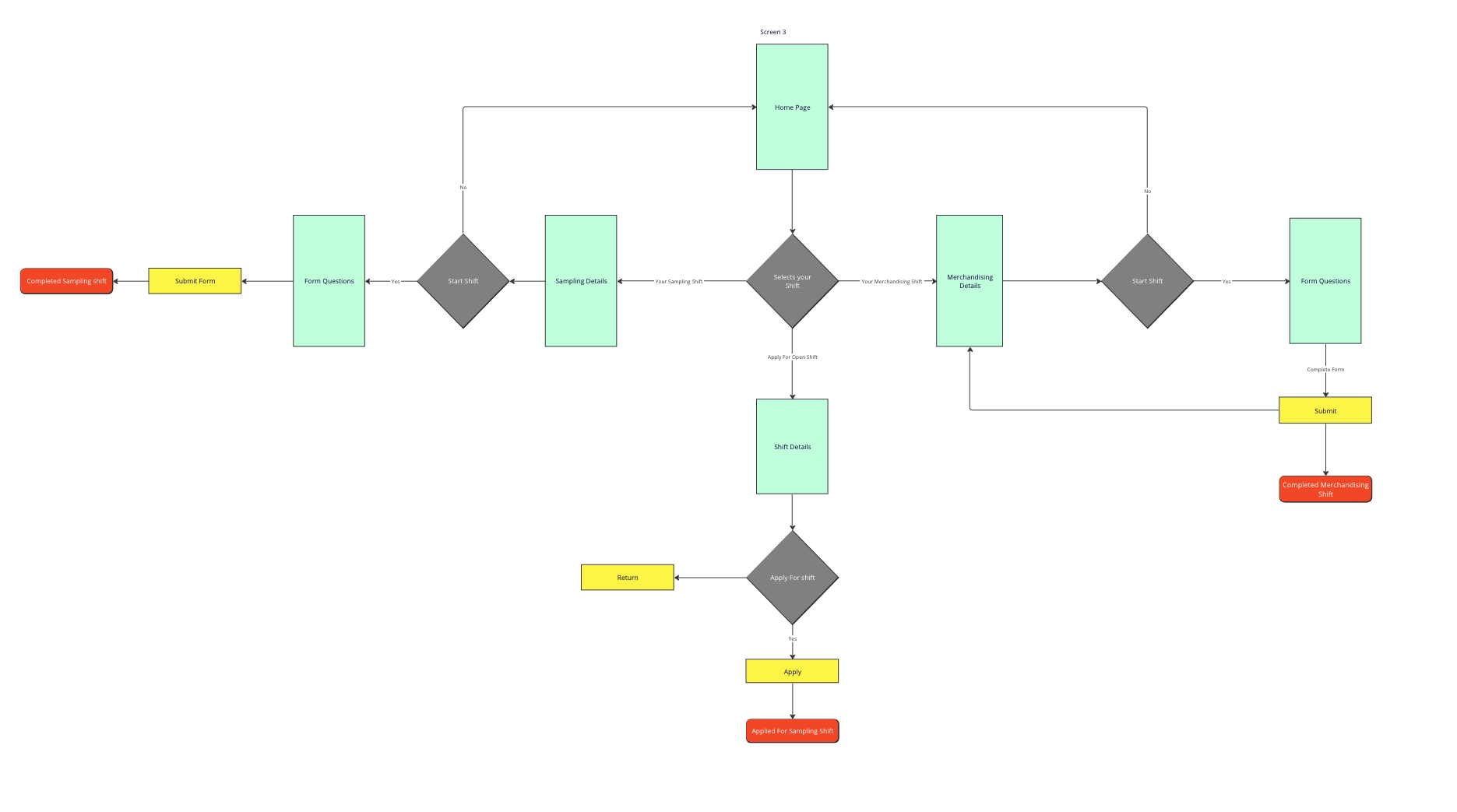
User flow Chart, Seamlessly Apply for and Complete Your Shifts
As noted from my user research, a significant issue with the current system is its poor navigation. Therefore, for my redesign, I emphasized improving the user flow, which is crucial to the success of my design.
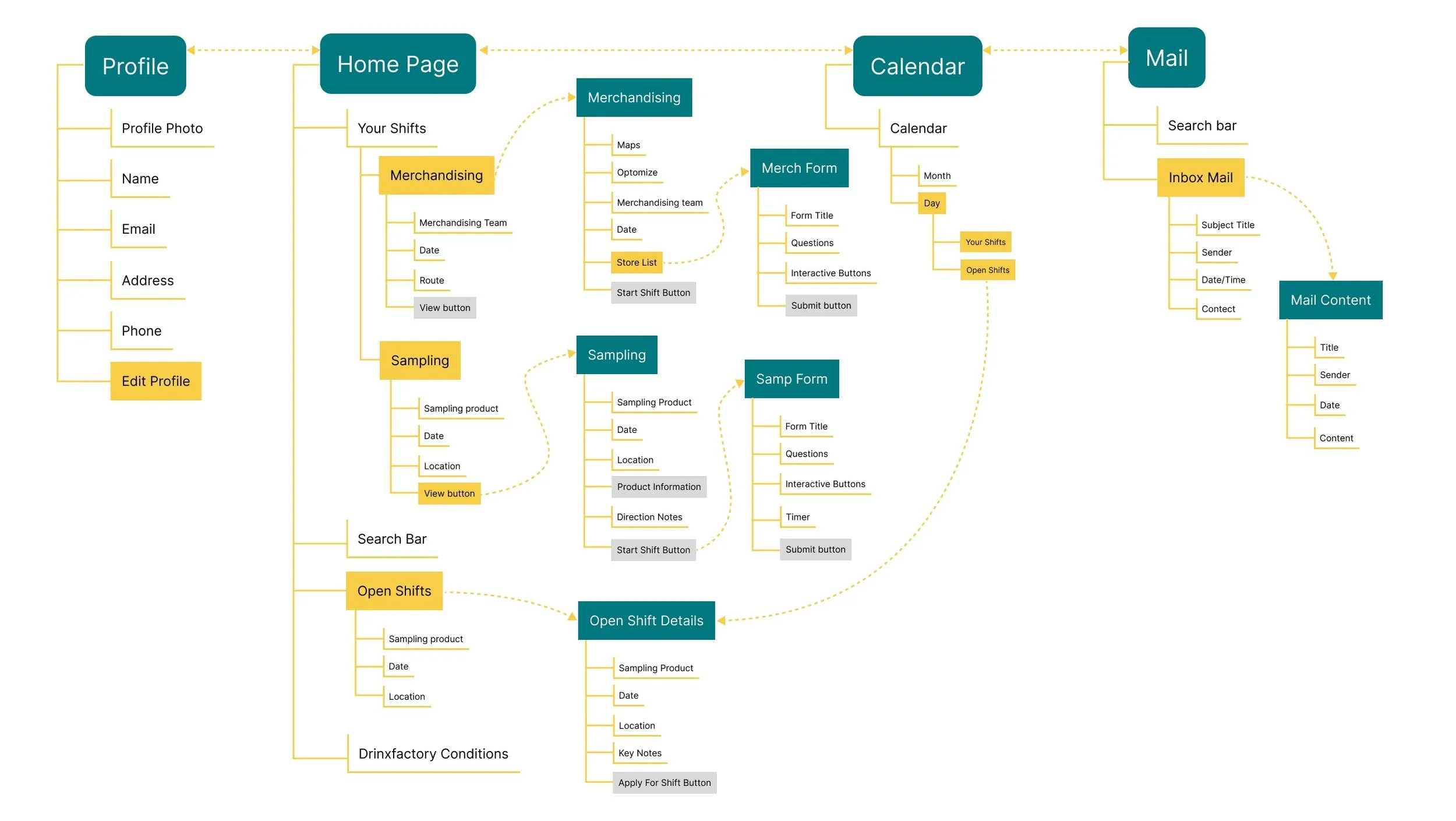
To gain a clearer understanding of the layout and user flow, I created a simplified information architecture. This ensured I had a solid foundation of what each page required, aiding me in designing with the confidence that necessary information was appropriately placed. While subject to adjustments, this reference proved invaluable throughout the design process.
WireFraming
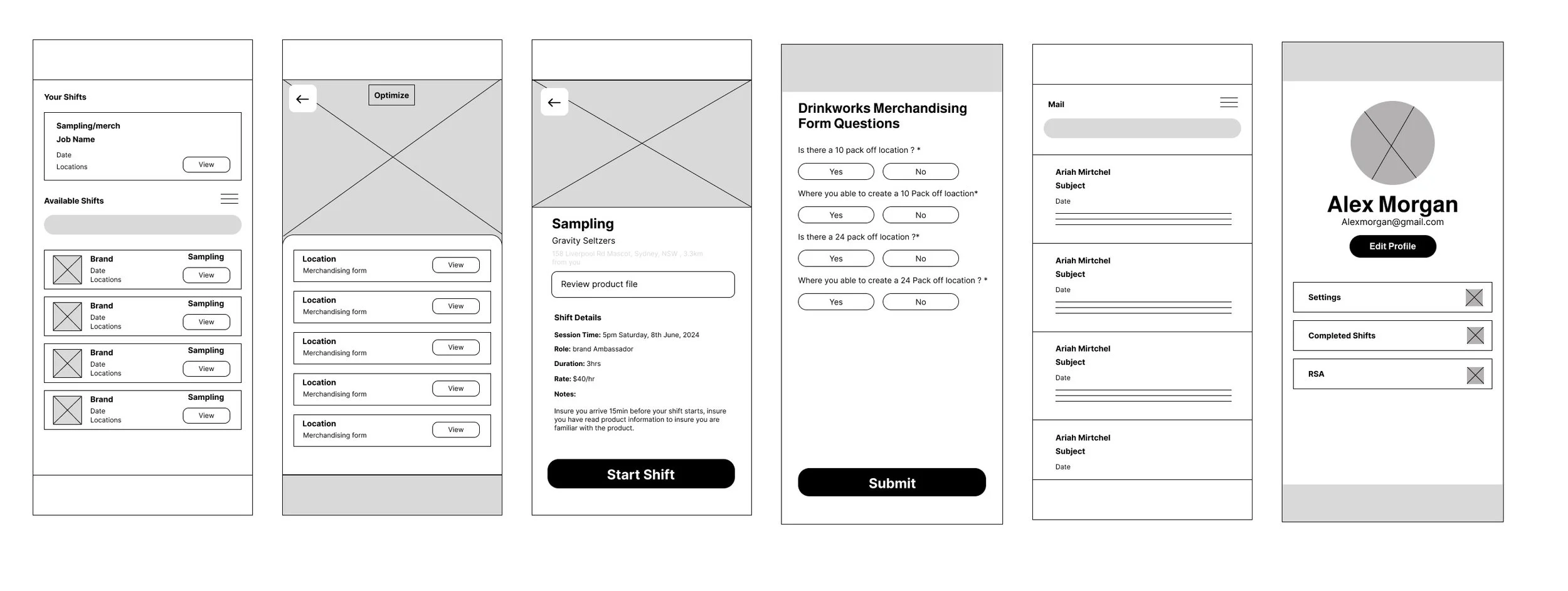
Creating simple wire frames was crucial for me in shaping the UI design for my project. They provided a foundational structure that allowed me to visualize and refine the layout and functionality of the app, ensuring a user-friendly and intuitive experience.
Two Key Takeaways from My Prototype Testing
Home Page
User Prototype Testing
I utilized low-fidelity prototypes to conduct a usability study of my design. These prototypes allowed me to quickly iterate and test various interface elements and user interactions without investing extensive time or resources. By gathering feedback early in the design process, I could identify usability issues, refine the interface, and ensure that the final product meets the needs and expectations of its users effectively.
Design Consistency
Users frequently observed inconsistencies in the design, particularly with buttons that varied between pages and disjointed page styles. By resolving these design discrepancies, we can greatly improve the user experience, ensuring a more cohesive and intuitive process for applying for and completing shifts.
Merchandising shift
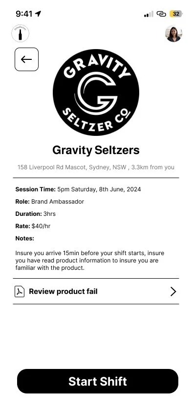
Sampling Job Info
Page structure and layout
Users pointed out that certain pages lacked clear structure, which made them challenging to read and navigate. Enhancing the layout and organization of these pages will create a smoother, more user-friendly experience, ensuring that applying for and completing shifts is effortless and intuitive.
Stage 2.3. Adjustments to my design
Key Changes To My Design
Throughout the design process, my project underwent significant transformations driven by both internal iterations and user feedback. By incorporating insights gathered from user responses, I iteratively refined and adjusted the design to optimize the overall user experience.
Keeping The Design Colors On Brand
Traditionally, the Drinxfactory brand has been associated with a black and white color palette, which I aimed to uphold in my design approach. However, I also introduced a hint of innovation by incorporating an aqua green hue. This addition provided a modern twist while honoring the brand's aesthetic heritage.
Stage 3. The Final Design
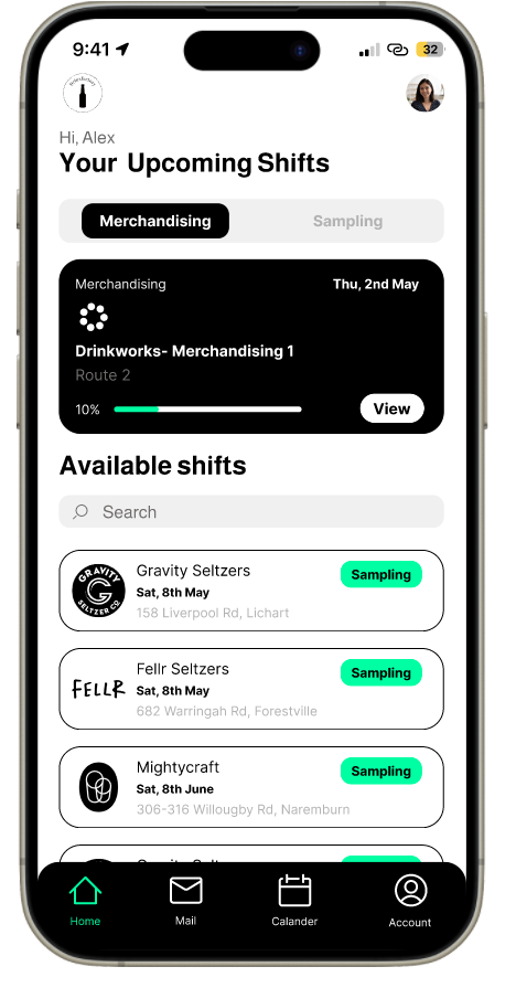
Home Page
Before
After
Sampling Shift
Form Questions
Before
After
Re-Design Solution
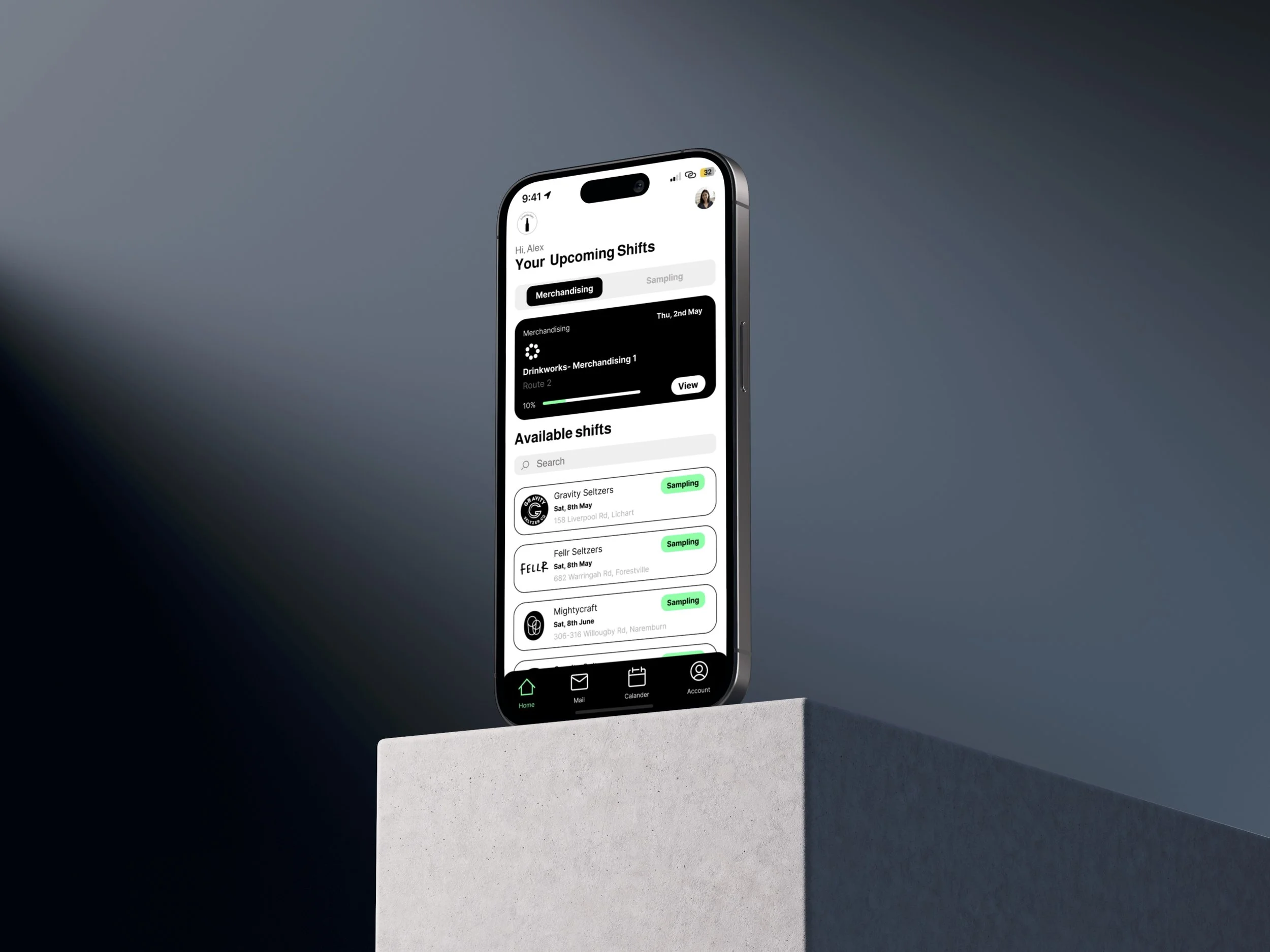
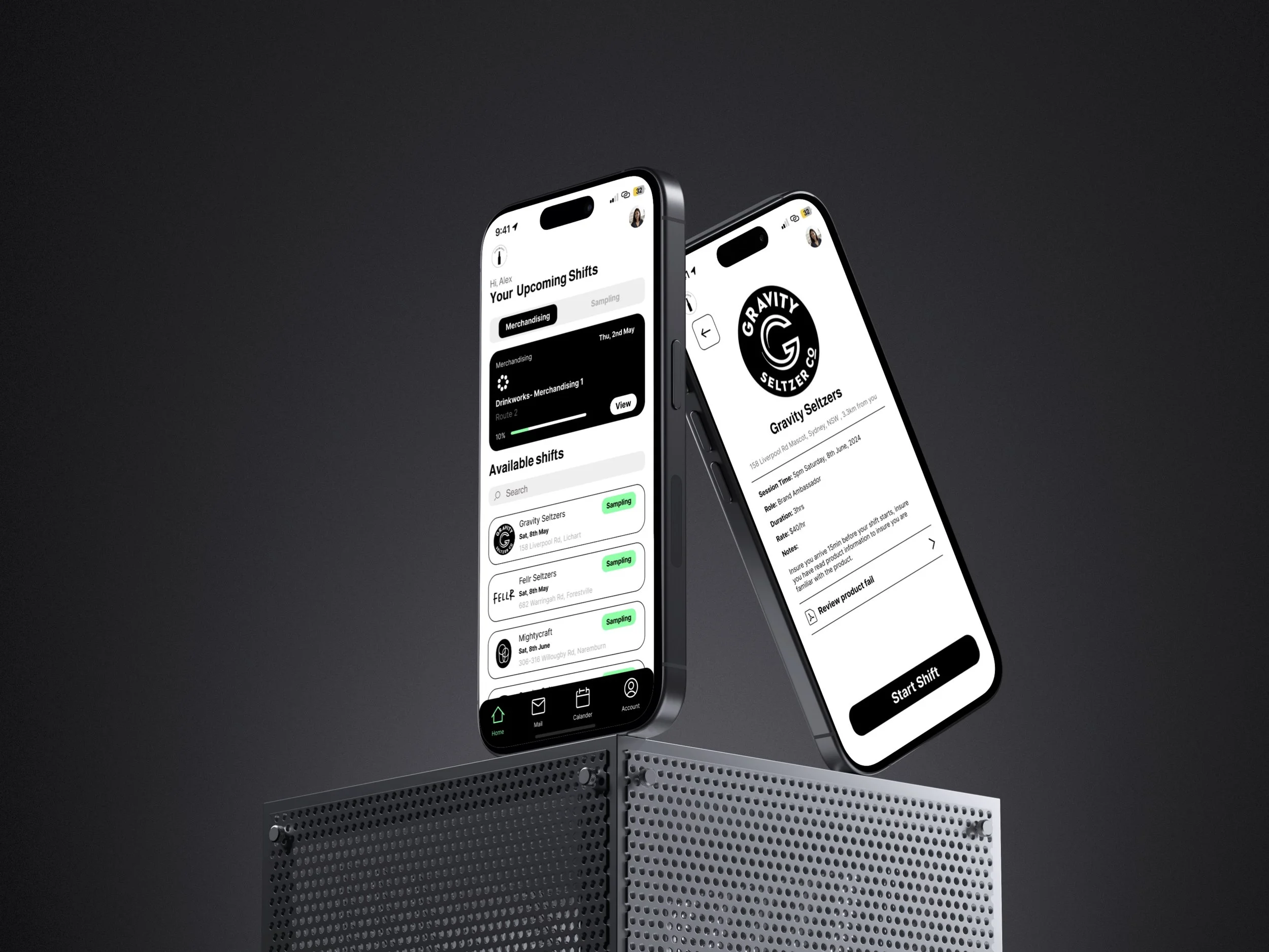
-View your upcoming sampling and merchandising shifts.
- Filter and apply for sampling shifts within a 50km radius.
- Track the progress and completion of your sampling and merchandising shifts.
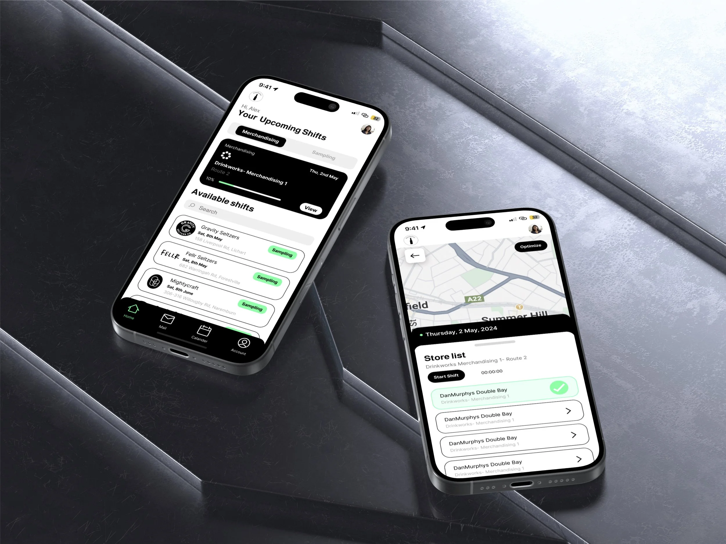
-Map feature showcasing the location of your stores.
- optimization feature that updates you route for optimal travel time.
-Shows the progression and completion of stores.
-Map feature showcasing the location of your stores.
- optimization feature that updates you route for optimal travel time.
-Shows the progression and completion of stores.
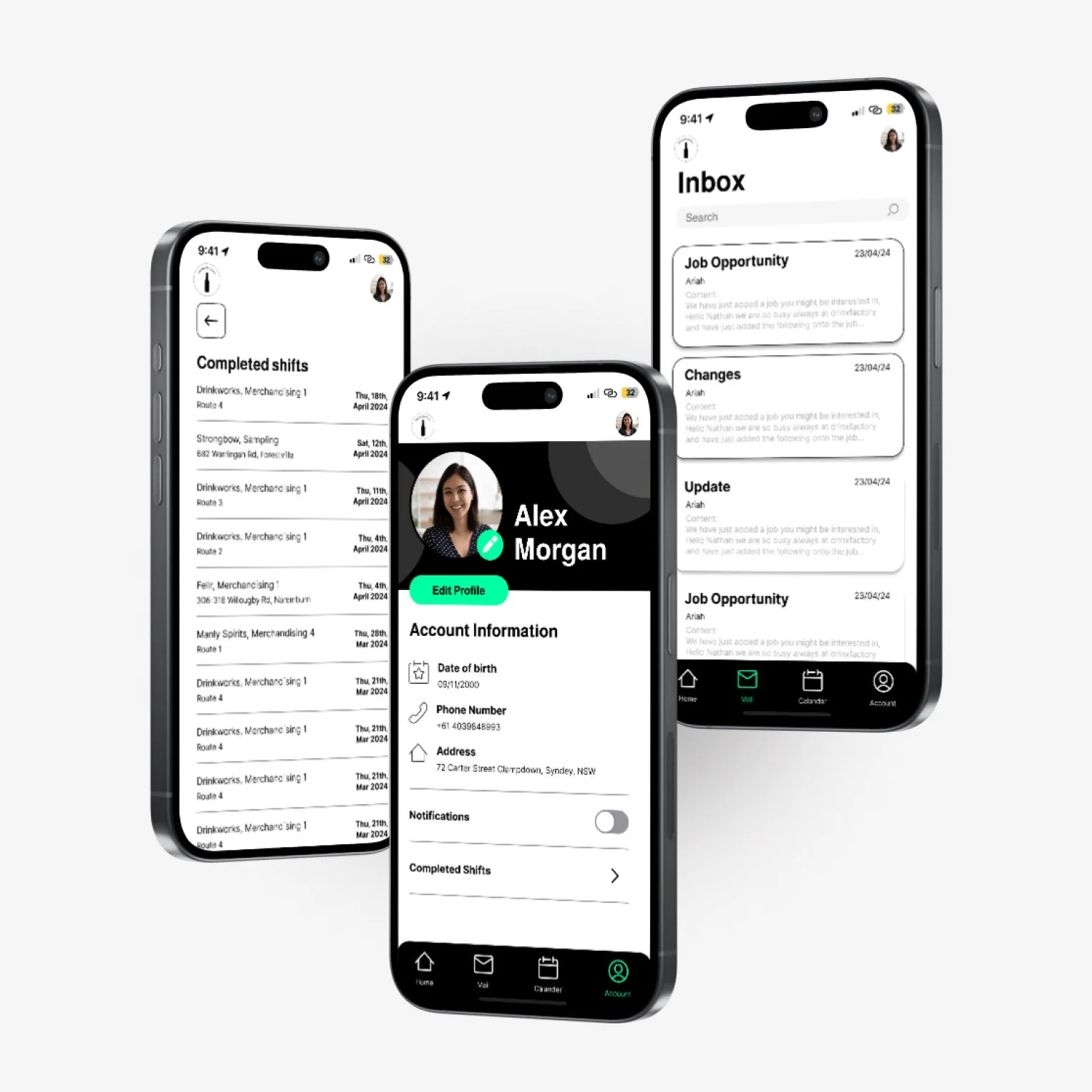
—personalized calendar allowing you to view upcoming and available shifts.
-Apply through calendar preventing double bookings.
-set notifications and reminders of shifts.
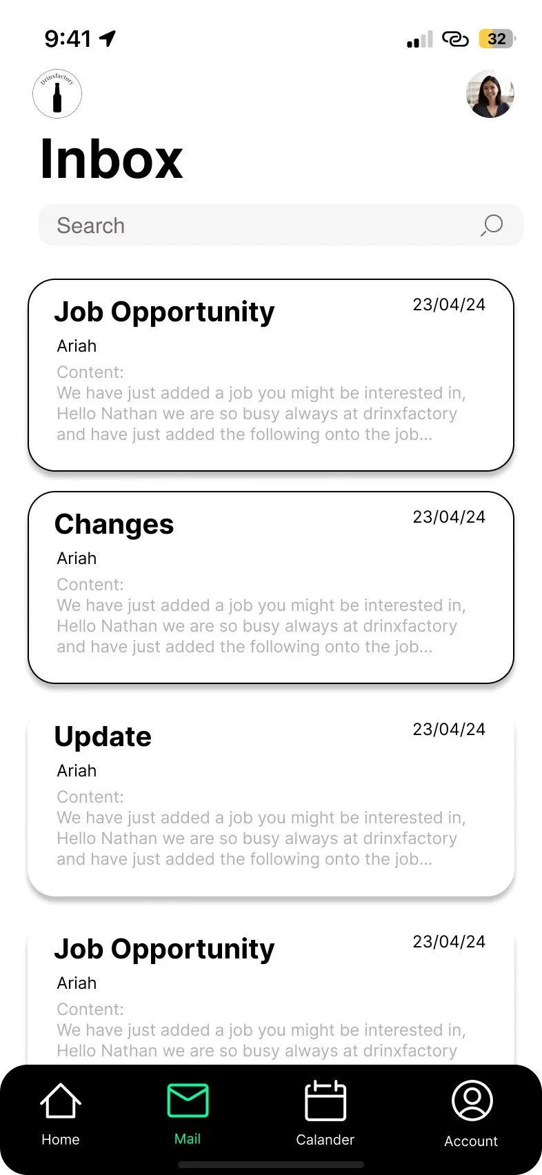
-mail inbox showcasing incoming of important emails.
-Shows you which emails you have viewed and alternative which ones you haven’t.
- easy to read and clear, much improved from original.
Home Page
Merchandising Job list
Calendar
Inbox
Merchandising shifts made faster and easier
Complete merchandising trips faster and easier than before.
user freindly map with optomize map feature allowing merchens to get to the next store quicker.
simplisic layout makes merchadising for easier to read and easier to compleate.
user feedback confirming your form has been submitted and showing the prograssion of your shifts
Easily Applying and Completing sampling shifts
Apply and view shifts through the calendar feature
view and apply for shifts through an easy to read calendar.
allowing employees to better set out there availability for shift, user expressed this was a much easier way to apply.
prevent double bookings.
allowing employees to be more organized with the structure and planning of there shifts.
Thank You For Reading!!
Easily find and apply for shifts.
Sort through available shift and apply within seconds.
shift details made clear and available for viewing prior to begin your shift.
timer that prevents user from sending of there foam before the shift has ended.
user feedback confirm your form has been submitted
