
Project Overview
Design a responsive website and app for an online camping store (Terratrek), the app and website must reflect the company’s values and showcase their range of products.
My Role
Solo student project (Google’s UX Design Certificate)
Timeline
8 January 2024- 19 February 2024 (5 Weeks)
The Solution
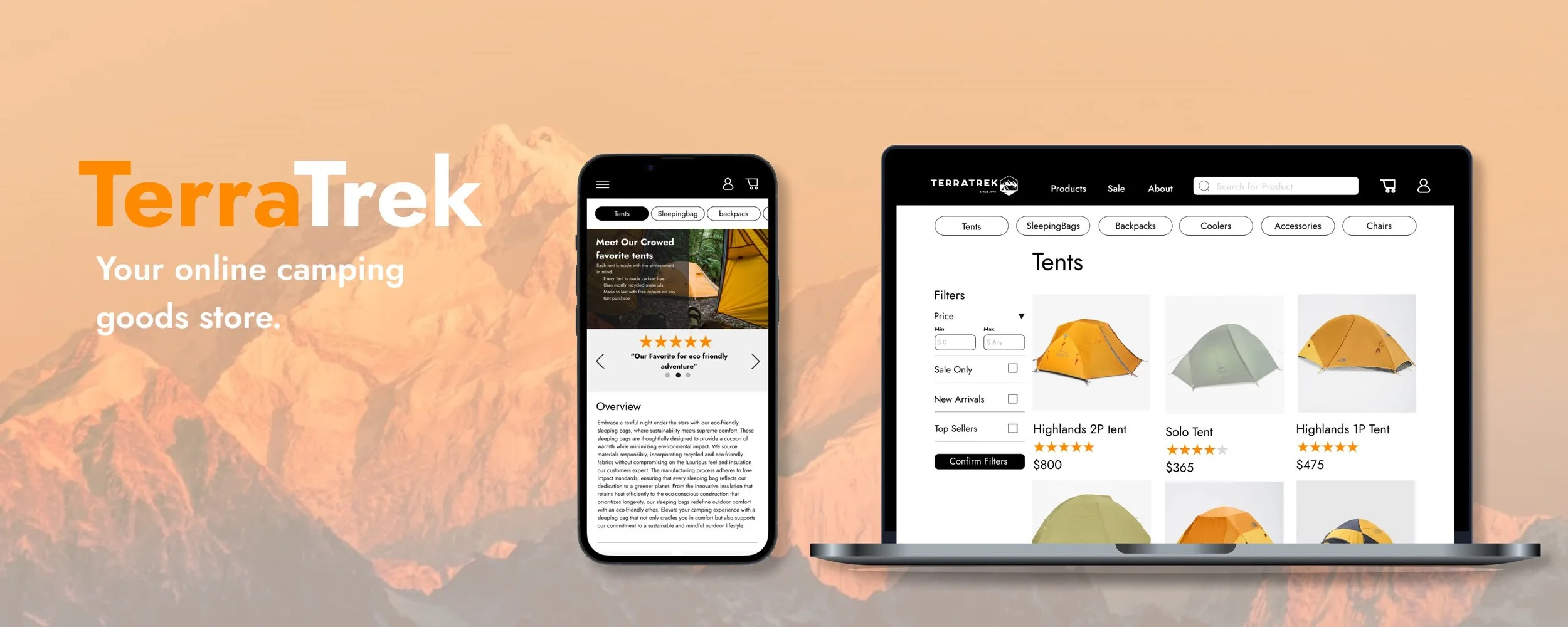
Terratrek final solution
TerraTrek
Terratrek is a fictional eco-friendly camping brand that I made up for this project. Their products include:
- Tents
- Sleeping bags
- Backpacks
- Coolers
- Camping accessories
- Chairs
The aim of the website and app is to allow customers to explore and purchase their range of products.
Problem
1) Navigating online camping stores can be overwhelming due to the excessive amount of information, products, and promotions inundating users.
2) For customers venturing into unfamiliar brands or products, building trust can be challenging as they lack substantial information or familiarity with the offerings.
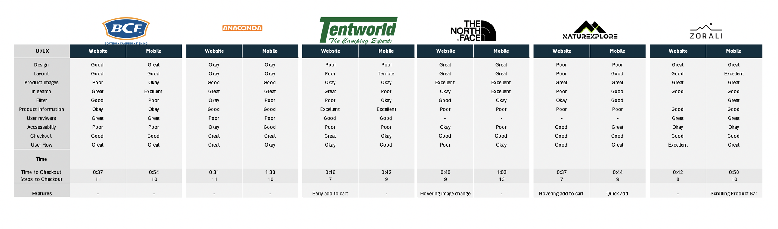
Through my competitive audit and user research, I found that many online camping stores had too much clutter, whether this be through too much information, products, promotion or images, there was too much going on. This affected the overall usability of the website and also diminished the product’s value.
Research
Competitive audit
User Research/Interviews
Asking interviewees to complete activities prior to the interviews allowed for significantly improved user feedback.
Prior to the interview, I asked users to complete a small activity on the competitor’s website to identify some pain points. Doing this allows users to have a fresh perspective, and significantly improves my research results. Note - I did try to conduct interviews without the pre-task and found that the results were not as strong, as users were focusing on what they could remember rather than how the website performed.
User interviews
Method:
Ask participants to complete 5 tasks on 3 different competitors’ websites and apps, followed by interview questions to understand their experience.
Number of Participants:
4 participants
Where:
Online (30min)
Research Questions 1 (Only Most Important Ones)
1) In your opinion what frustrates you about online shopping?
2) What is something important to you when buying something online?
3) What is something you like about online shopping
4) Would you buy a product online that you have never heard of before?
Research Questions 2 (Only Most Important Ones)
1) Were there points during the exercise where you felt lost or confused? If yes, why?
2) In your opinion which website was the best and why?
3) Which was the easiest to use and why?
4) In your opinion which website looked the best and why?
5) What features did you find during this exercise helped you complete your task faster?
6) Out of the 3 websites which one do you think has the best quality product?
The Main Insights
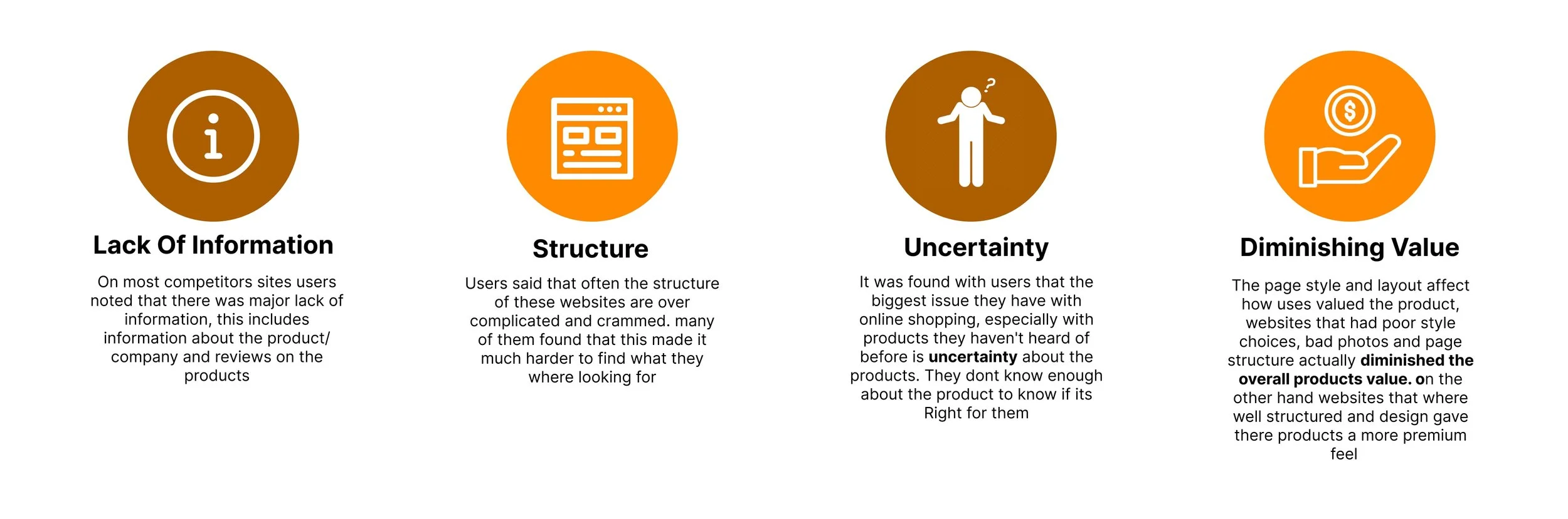
Users did not feel extremely confident with purchasing a product that they knew little to nothing about
Based on my trends in the affinity diagram, users’ feelings of uncertainty about purchasing a product can be attributed to a lack of information. On the other hand, it may also be attributed to users mis-valuing the product.
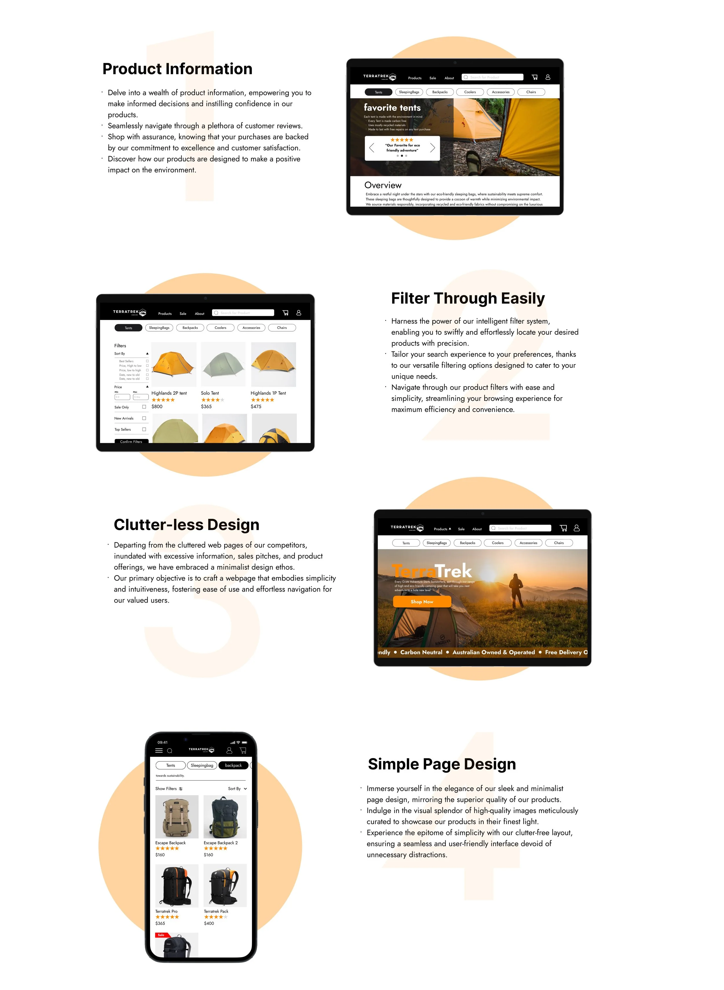
Testing and Improvements
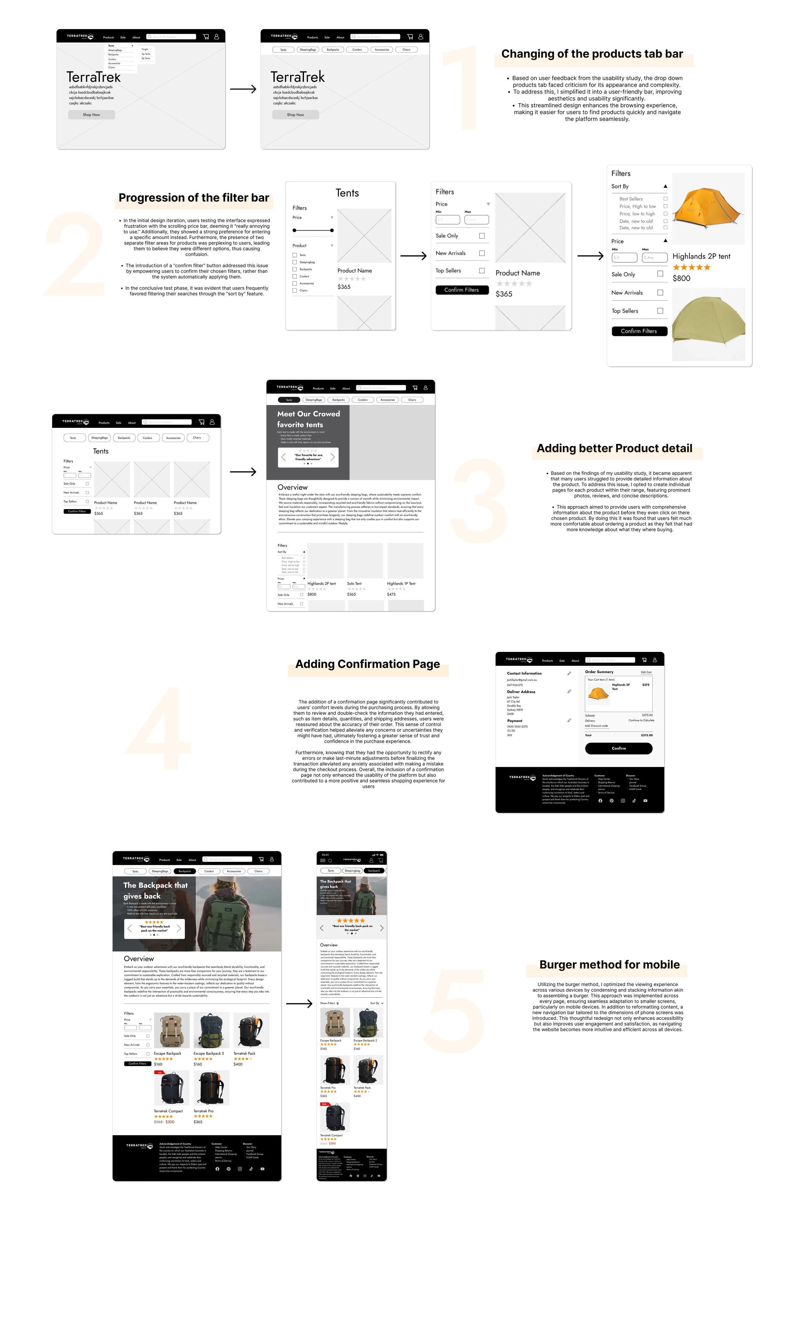
5 major changes to my design
Based on various feedback from peers and feedback from my usability study, I continually iterated my design over a span of 2 weeks and made 5 major upgrades to my design.
The Final Design
The Final Product
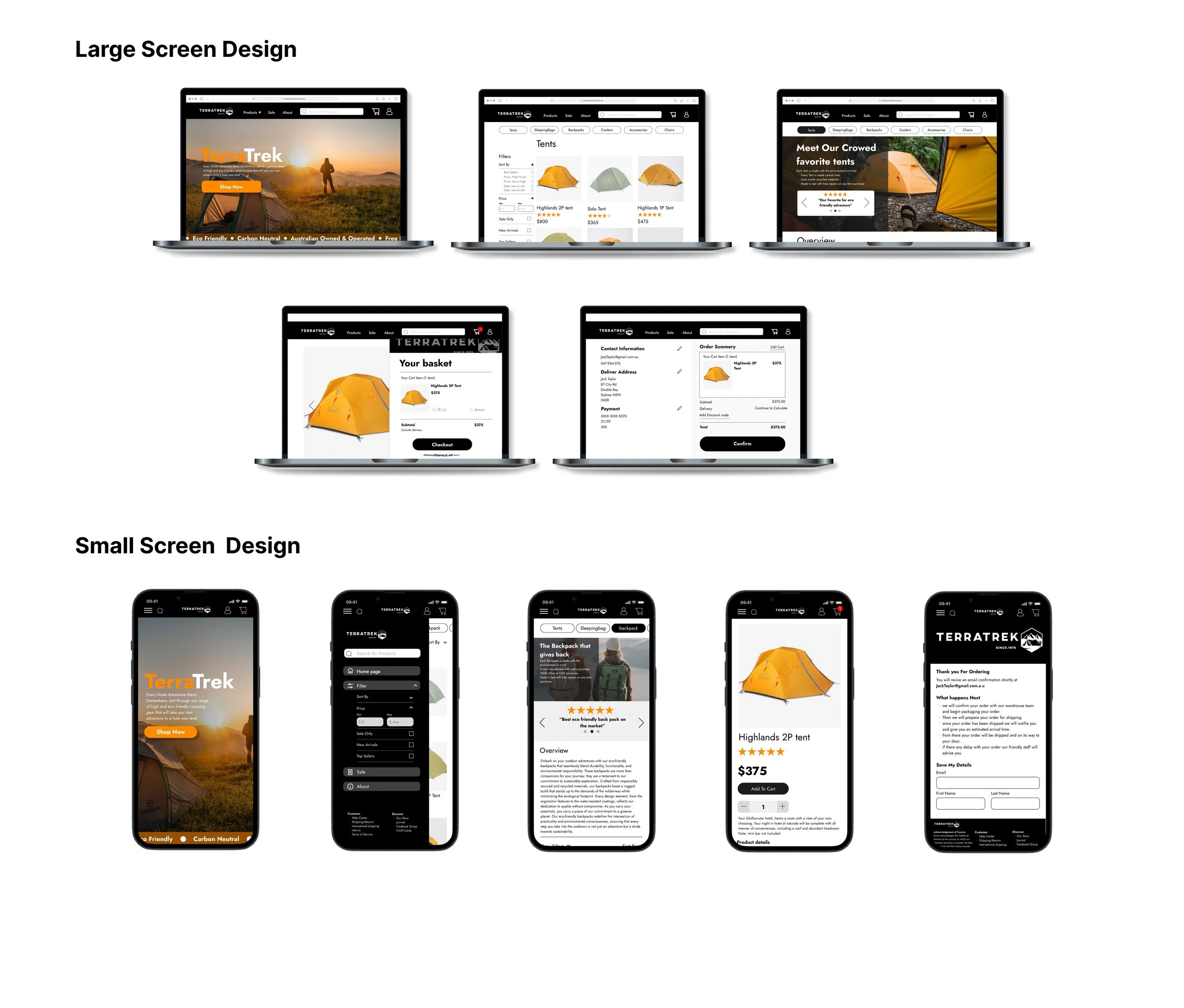
The Final Design
What I would do differently next time
Exploring the Top Icon Bar: Upon reflection, I believe there is significant potential for improvement in the design and functionality of the top icon bar. The current design, while functional, lacks the sophistication and sleekness that could elevate the overall aesthetic and usability of the project. By re-imagining the icon bar with a more refined and visually engaging design, we can enhance user interaction and streamline navigation, ultimately enriching the user experience.
Refining the Checkout Page: In retrospect, I acknowledge that there was room for greater attention to detail in the layout and user-friendliness of the checkout page. A more thorough examination of the page's design could have resulted in a layout that is not only more intuitive for users but also visually appealing. Introducing strategic elements of color and optimising the arrangement of information could contribute to a more seamless and enjoyable checkout process, fostering customer satisfaction and retention.
Enhancing the Cart Popup: While designing the cart popup, I recognise that time constraints led to a rushed implementation, potentially compromising its effectiveness. Given the pivotal role of the cart in the user journey, investing additional time and effort into refining its style and dimensions could have yielded significant benefits for the overall appearance and functionality of the website. By meticulously fine-tuning the design and ensuring alignment with the site's aesthetic, we can create a more seamless design.